Nikita Mishra
Mar 30, 2023

Pepsi unveils a new logo: a look back at the logos through the years

A bold leap forward, the design reflects changing consumer tastes and the brand's digital ambitions. Also, it comes just in time for Pepsi’s 125th anniversary.

Photo: PepsiCo
Photo: PepsiCo

Few things are ingrained in our heads, such as the logos of iconic global brands. Millions of dollars are spent on creating a visual identity that earns a tiny space in your head, so when a cola major like Pepsi unveils a refreshed identity and logo, it’s a big deal. 

The soda brand has shared its first significant rebrand in almost 15 years. CMO Todd Kaplan says this new visual design will usher in a “new era” for Pepsi and will help to drive brand distinction, in a press statement. 

Pepsi experimented with asking people to sketch their logo from memory. Most respondents drew a circle in the signature red, white and blue stripes and put the brand name in the middle. However, that’s not how the current logo appears. ‘Pepsi’ is off-centred, overshadowed by the iconic 'globe'. Instead of rejecting the insights, Mauro Porcini, PepsiCo’s chief design officer, says they decided to embrace this recollection stuck in people's brains. 

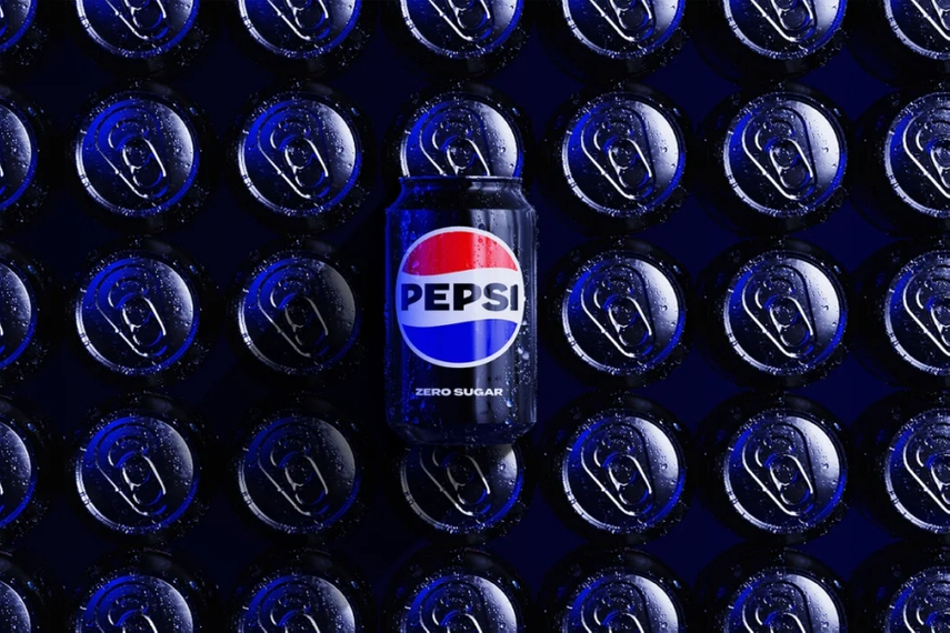
The refreshed identity “borrows equity” from the brand’s 125-year history and draws inspiration from the logos of the 60s, 80s and 90s. The most significant update is that the 'Pepsi' wordmark once again sits right in the midst of the yin-yang globe—exactly how it was for children of the ’80s and ’90s. It also features a bold new colour palette, a white wave, and a retro-inspired, uppercase typeface (per the brand, that’s reflective of its "unapologetic mindset"). The blue is more 'electric', in fact, closer to purple than midnight, the black lettering a throwback to the logo of the 1960s.

Yet, the brand refresh is anything but a simple nod to nostalgia. The emphasis on black and sleekness is a significant departure from its traditional design. It is similar to Pepsi Zero Sugar, signalling a pivot towards healthier choices and a more health-conscious lifestyle. A move aimed at expanding Pepsi's reach among the GenZ cohort, a third of them claim to cut down on sugar entirely. 

"At PepsiCo, we design our brands to tell a compelling and holistic story. Pepsi is a shining example of a brand that has consistently reinvented itself over 125 years to remain a part of pop culture and a part of people's lives," Mauro Porcini, SVP & CDO of PepsiCo, said in the press announcement.

"We designed the new brand identity to connect future generations with our brand's heritage, marrying distinction from our history with contemporary elements to signal our bold vision for what's to come."

Created in-house, the new logo rolls out in North America this fall and globally in 2024.

It will span across all the brand’s physical and digital touchpoints, including packaging to fountain and cooler equipment, along with fashion and dining. 

Taking a cue from this change, we rummage through the archives to show the brand's changing logos over the years since its inception in May 1863 under the name Brad’s Drink.

The original (1898-1905) 


The first logo was created by Caleb D. Bradham, a pharmacist and the inventor of the formula for the first Pepsi-Cola in New Bern, North Carolina in 1898. The font was a simple script, in the classic red and white colour scheme. The style was true to beverage's early days when Pepsi was marketed as a digestive aid, helping to relieve indigestion and other stomach ailments.

The 'double dot' (1940-1950)
 
Left: logo from the early 40s, Right: slightly tweaked version of the 50s

The 'double dot' (or the logo with a colon) is from the early 40s. A modernized tweak was rendered toward the latter part of the decade when Pepsi-Cola made its television debut. The colon gave way to a hyphen; the vintage feel and the red, blue design stayed. This was also the first time Pepsi tilted the brand conversation to focus on the beverage, talking about carbonation and emphasising its unique bubbly flavour and refreshing qualities.
 
The 'Pepsi globe' (1973-1991)
 
 
The 1970s marked a turning point for the beverage giant. The brand focussed shifted to popular culture and to cater to a younger, fresher cohort. The 'Globe' logo was born and the brand name positioned in bold letters. This design was a reflection of their new direction, their cool quotient and youthful energy.

The "new generation" (1991-2003)
 

In the 1990s, Pepsi revamped its logo again, introducing the "new generation" logo. This design featured a more streamlined and modern font, as well as a blue and silver colour scheme. Once again, it was a reflection of the brand's ongoing efforts to appeal to popular culture and attract a younger, more diverse audience.
 
The "simplicity" (2003-2008)
 
 
Minimalist, simplistic the 2003 logo featured a blue and silver palette and a sleek, modern font. The clarity and simplicity of the logo was meant to highlight the purity and clean taste of the soda. 

The "refresh" Pepsi Logo (2008-present)


At the time, the diagonally-oriented "smile" through the red and blue ball and lowercase letters was the boldest shift Pepsi had made since separating the word from the circle in 1991. The signature swish element was to signify movement and energy of the dynamically evolving world. 
 
The latest makeover comes as a host of companies—including Domino's, Mills, General Mills—continue to play with retro packaging amid a surge of nostalgia from maturing Gen-Z consumers.

 
This post is filed under...
Rebranding exercises


Source:
Campaign Asia

Related Articles

Just Published

1 day ago

Creative Minds: How Yuhang Lin went from dreaming ...

The Shanghai-based designer talks turning London Tube etiquette into a football game, finding inspiration in the marketing marvels of The Dark Knight, and why he wants to dine with Elon Musk.

2 days ago

Happy holidays from team Campaign!

As the Campaign Asia-Pacific editorial team takes a holiday bulletin break until January 6th, we bid farewell to 2024 with a poetic roundup of the year's defining marketing moments—from rebrands that rocked to cultural waves that soared.

2 days ago

Year in review: Biggest brand fails of 2024

From Apple’s cultural misstep to Bumble’s billboard backlash and Jaguar’s controversial rebrand, here’s Campaign’s take on the brands that tripped up in 2024, offering lessons in creativity, cultural awareness, and the ever-tricky art of reading the room.

2 days ago

Former GroupM China executives to face Shanghai ...

EXCLUSIVE: The trio will appear before Shanghai's Intermediate Court next week, marking the latest chapter in the bribery scandal that rocked WPP's GroupM China in October last year.